When people think of design documents for games the great “game design document” always comes up. Lets not forget it’s not the only one, at peripheral labs we have three main design documents, the game design document, which outlines the gameplay. The technical design document, which outlines technology to be used, game engines, graphics techniques and so on. Then we have the art style guide, something commonly associated with web design and graphic design. I think its just as important in video games.
A style guide sums up the discoveries of concept artists
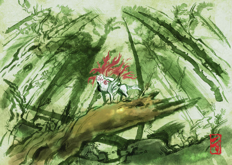
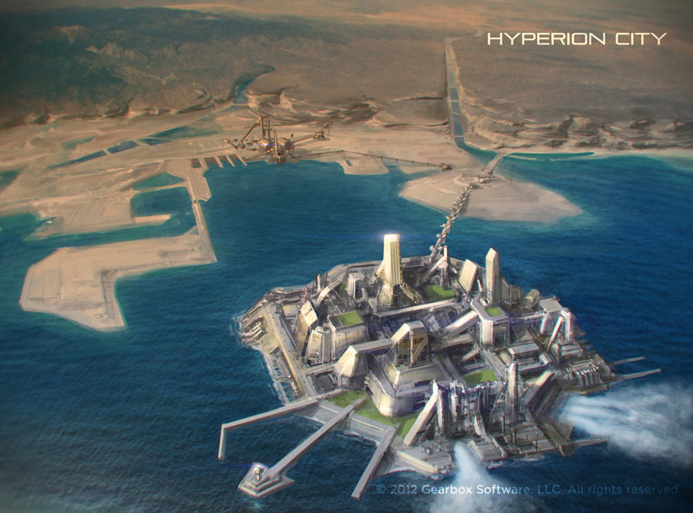
Making a great looking game often requires a large amount of concept art. This is normally done long before production of the game occurs and it helps to develop the world and the characters of the game, for this it is hugely important. Concept artists normally have a large say in the style guide because, well, they came up with the style. Examples of games with very memorable art style would be in my mind Okami, and Borderlands. Check out these concept art images that helped define their respective style guides.
The style guide gathers together all the iterations and experiments of the concept artists into one place so game artists know what they are trying to work towards, which brings me on to my next point.
Production Artists have direction
When you have a style guide, artists actually making content for the game have somewhat of an “art bible”. They can flip through the style guide to see things like what color palette should be used for this character, should this have outlines, should it be cartoony and bright or dark and mysterious? When all the artists working on the project have this guide they all have the same direction. They know what they are working towards. When all the artists have a common goal you get consistency.
Consistency is the key to an attractive game
When taking part in a game development competition called Ludum Dare I was told to make sure all my art was in a consistent style. The competition gave me 48 hours to make a full game, art, programming sound and all. Making an attractive game in that time is hard. I soon realized this advice was right. Even if your game has pixelated, simple graphics it can look very good provided a consistent style is used throughout. There was one game which had all pixelated graphics in one color, blue if I remember rightly on a black background. It wasn’t super realistic AAA graphics but it really did look rather good. There was other games using placeholder art found on Google images, that did not look so amazing as the style didn’t match throughout the game.
The point I am getting at is that when you have a style guide, even if you are working by yourself the art will stay consistent because whatever you do is influenced by a core set of rules to apply to all the art for the game. These principals can be applied to a lot of art related things, like CGI animation, comic’s and the list goes on. Hopefully you have seen how writing a style guide can really help your game’s art, and make it “stand-out” amazing. It need not even be long, just couple of pages with bullet points and some sketches, but it will help. The Liberated Pixel Cup has an excellent example of a style guide hosted on their website. Check it out here to see what a style guide looks like.
I would love to hear what you think about style guides and whether you use them in your game development in the comments below!


